A go-to icebreaker of mine is to tell folks I am a serial-hobbyist. As in, I’m someone who loves to take on a new hobby, and can often. be found exclaiming “as if I need a new hobby!” when someone shows off their new mugs they just made in a pottery class (but seriously, should I take pottery?). Almost a decade ago now, a friend of mine really wanted to learn quilt making, but she didn’t want to go to the classes alone, and she knew I’d be the easiest person to convince to such a thing.
I’ll admit I wasn’t super hooked on my first try. I finished the quilt from the class, it was cute. But I was much more into sewing clothes than quilts. I had a whole shelf of novelty print fabrics waiting to. become shirt dresses!

This quilt is one of my early-in-the-pandemic projects, and is shown here after the long arming. Photo by Orlando Ramos.
And then… (you know what’s coming!) the pandemic hit. Why make new clothes when I didn’t have anywhere to wear them to? One of the big draws of making your own clothes is that they are unique and people will always comment on them, and you can say “I made it (and it has pockets!)!’
So, with piles of fabric and no inspiration for clothes, I started to quilt again. And 4 years later, I have made over 20 quilt projects (from wall hangings to queen size quilts), and even attempted my first pattern from scratch (the colorful rainbow quilt you’ll see within the photos posted here). I joined a mystery quilt group where you don’t know what you’re sewing but every week you get new instructions as you slowly put stuff together to find out what it is (what a fun community!).


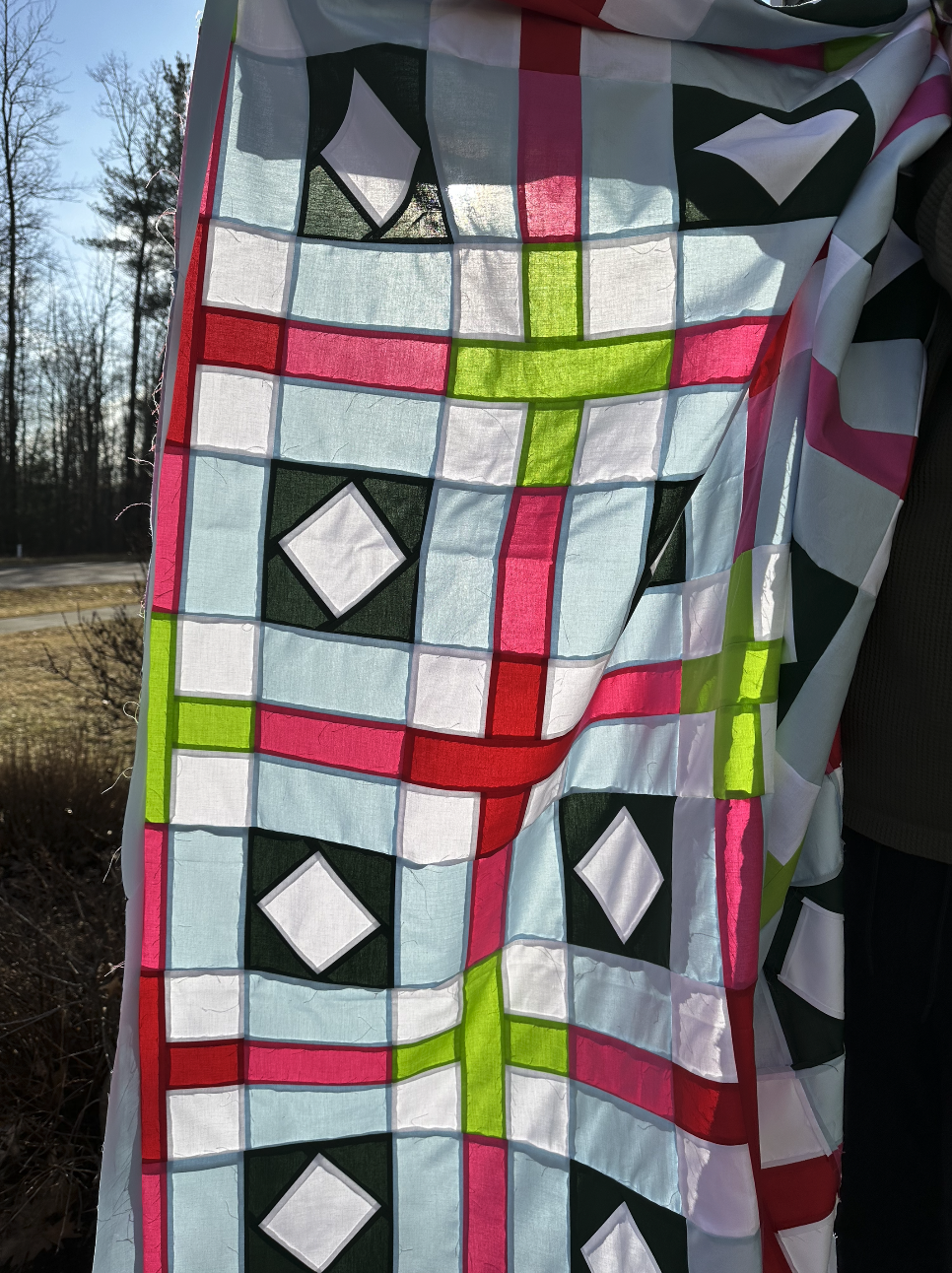
Process of creating my self-drafted rainbow quilt pattern: After creating the pattern pieces on illustrator, I cut
and pieced together a mock up in a variety of scrap fabrics. Once I was happy the pieces were working together,
I cut into my main fabrics and slowly pieced each block till I had the whole quilt. The long-arming was done by a
different seamstress that specializes in that (and this being such a special quilt, I wanted all the bells and whistles).
And of course, being a designer, I have a tremendous advantage when it comes to crafting. My day job is a craft. I deal with colors and shapes and placement. It’s natural that in my free time those same skills are bumping around in my head, and it’s easy to make the swap from pixels to fabric. Knowing how illustrator and quilting works is how I was able to design my own pattern pieces. I knew about seam allowance and how to add them to my vectors (design the patter pieces as their finished size, then add a .25 inch border around it, voila, easy seam allowance and zero math!). And picking colors that will go together is so easy when you know color theory and can use software to mock the finished quilt up with the colors you chose.
When just the top pieces are sewn together, it almost looks like a glass mosaic art in sunlight. This is one of my current work on progress quilts. I am quilting it myself, without using the services of a long-armer this time.
I also believe that my crafting pursuits outside of my work hours are important to keep my mind fresh and creative, in different ways than how I am at my job. And having those moments and working with different mediums, can only make me a better professional graphic designer too. Quilting also teaches you a tremendous amount about patience, attention to detail while also letting go of perfection, and the value of craft. All things important for a designer to have. When you’re making a quilt, you have many steps, many of them incredibly repetitive, parts you don’t really love to do (binding and pressing for me) but are part of the process and a quilt can’t exist without it. And a craft like this is also a lesson in mindfulness and meditation.
Basically, what I’ve been saying is… get a hobby!!!! Do something with your hands, learn something new, just cause. It doesn’t have to be perfect and you don’t even have to stick with it if you don’t like it. But at least try it! It’s good for you, even if it adds nothing to your professional development. I have been trying to make a case here that quilting is great for my design career (and it is), but I’d do it even if it meant nothing. It’s like reading to me, it’s my self care and my passion.

One of the first “mystery” quilt sew along I joined. I had no idea what the final top would look like till after 6 weeks working on it! I love how the earthy colors work with the accent brights, it was a risky combo that payed off.
Note: if you try quilting (or knitting, or crochet), I hope you like blankets. I don’t know who needs six lap blankets in their living room couch, but at least I live somewhere where it’s cold for nine months of the year.